
The bench · Salinas, CA

Not A Cover Mill — A Lamp Left On For Your Book.

We’re a two-person studio on Sherwood Drive that treats a manuscript like something you can smell: the damp of a harbor town, the dust of a spell gone wrong, the warm vanilla of a slow romance. Then we build a face a stranger reaches toward across the shop.


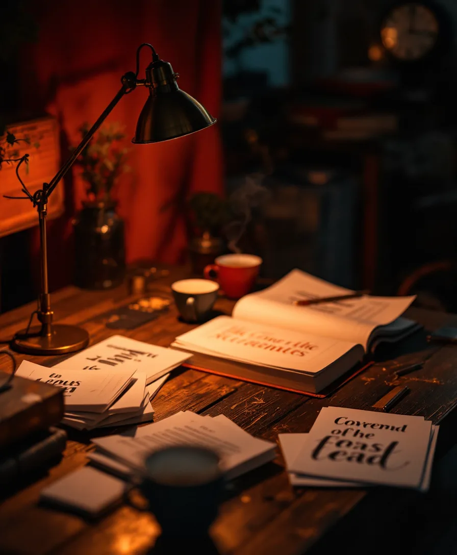
A book cover studio bench at dusk, proofs and sketches under a warm brass lamp The bench after dark

It Started With A Shelf Of Good Books In Bad Jackets.

Nettle & Lantern grew out of a frustration we kept running into at the library sale table: wonderful stories wearing covers that whispered “template.” A 90,000-word world squeezed into a stock photo and a drop shadow. We knew those authors deserved a face that matched the writing inside.

So we set up a bench — literally one long table, two chairs, and a lamp that stays on past closing — and started designing covers the slow way. We read the book first. Not the blurb. The book. Then the type, the palette, and the mark all come from the story rather than a passing trend.

Today that bench dresses debut novels, re-skins tired backlists, and builds whole reader sites — but the rule hasn’t moved. Every title that leaves here has been read, argued over, and lit properly before it ships.

What the bench runs on

Four Things We Won’t Bend On

The thumbnail decides

A cover that only works at 11×17 is a poster, not a cover. We design at the size a reader actually sees first — 120 pixels tall on a glowing phone — and work up from there.

Genre is a language

Cozy mystery, grimdark, slow-burn romance, verse memoir — each shelf has its own grammar of light and type. We speak it fluently so your book lands with the readers who already love it.

Three doors, never one

You always see three distinct cover directions — different nerve, different hue — before you commit. A single take-it-or-leave-it JPEG isn’t a choice; it’s a dead end.

Files that behave

Bleed, trim, ink coverage and spine math handled, so your proof arrives from the printer looking like the screen — not two shades darker with the title clipped off.


Two designers working side by side at the Nettle & Lantern bench

Two Sets Of Eyes, Your Whole Launch.

There’s no account manager, no handoff to a stranger halfway through. The same two people who read your manuscript sketch the wordmark, build the cover, and lay out the reader-site visuals — so nothing drifts out of tune between the spine and the homepage.

We like small numbers on the calendar. Taking only a handful of titles at a time means your book gets argued over properly, not stamped out between forty others.

  • The reader at the table

    Reads every manuscript end to end, maps the genre shelf, and writes the design brief from the weather of chapter one.

  • The hand at the lamp

    Draws title candidates by hand, kerns them to the half-pixel, and makes the print and web files behave wherever they land.


A few honest details

The Small Print, Said Plainly

  • Roughly two weeks. Most kits land about 14 days from the signed brief, print files and web visuals included.
  • We read first, draw second. Every project starts with the actual manuscript, not a one-line pitch.
  • Based only in Salinas. We work with authors anywhere, but the bench lives at 150 Sherwood Dr, CA 93901.
  • Evenings by appointment. Office hours are Mon–Fri 11am–4pm; night-owl calls can be arranged.
  • Print-shop ready. KDP and IngramSpark templates squared away at 300dpi with bleed, every time.
  • Revisions until it rings true. We refine the chosen direction until it feels inevitable, not merely fine.
The lamp’s still on

Bring Us A Manuscript And A Feeling.

Tell us the title, the genre, and what you want a reader to carry off the shelf. We’ll read it, light it, and bring three ways in.